Ninjas Vs Robots
A downloadable game for Windows and macOS
Creators: Kevin Chen, Ethan Philipot, Juliana Soranno
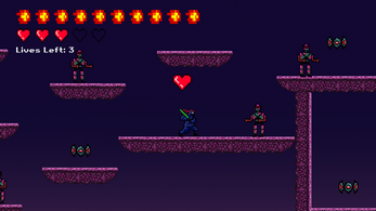
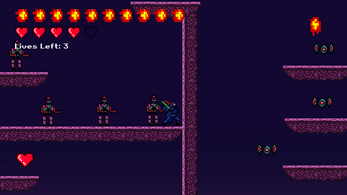
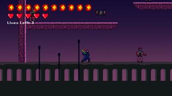
Ninjas vs Robots is a single player 2D platformer where you play as a ninja and fight your way through a city riddled with robots. In designing this project, we wanted to achieve a cyberpunk aesthetic. In particular, we were inspired by games like Cyberpunk 2077 and movies like Tron. We aimed to create a game that involves both puzzle and fighting aspects. The game consists of 5 levels where the player needs to find a key through a swarm of mobs in order to open the door to the next level. If the player dies 3 times, the game will be over.
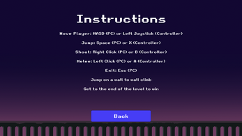
Keyboard: WASD to move
Spacebar to jump/wall climb
LMB to melee attack
RMB to shoot
Controller (Optimized for Xbox Controller on Windows): Left joystick to move
X to jump
A to melee attack
B to shoot
Development log
- SourcesMar 11, 2022
- Devlog 2: PostmortemMar 11, 2022
- Devlog 1: Devlopment and PlaytestingMar 11, 2022


Comments
Log in with itch.io to leave a comment.
Liked the variety in ways to perform attacks, adds additional depth to the game. The overall background/lighting I thought went really well with the rest of the colors you used for the assets, everything kind of matched and that was really satisfying to look at as I was playing. Great job!
The love the sprites in this game, especially the ninja! I thought it was super well done! I really like the idea that it has to collect the bullets. I think this is an added challenge when fighting off the enemy. Because otherwise you have to fight it off yourself rather than firing a bullet.
I really like how we can keep track of how many lives we have left and how many bullets we have collected.
It was really fun to play! Well done!
The game is so cool and I really love the idea of two different way of attacking. The sprites are really detailed and consistent and fit with the background. The design of difficulty is super great and smooth. To sum up, I really love it!!!
The art is overall so well done but I especially love the color palette and lighting chosen! Something about the purplish-pink has the right degree of ominous. It's also a great contrast to the dark color of the ninja.
The only thing I would say could use improvement is the story. I wanna know why I, a ninja, am fighting robots in a city.
I can see there are lot of improvements being made based on the previous version. long-distance attacks are added and bugs of climbing the walls are fixed. More actions are added to the player. The overall game experience is great with difficulty from easy to hard.
Some suggestions will be it will be better to have different kinds of enemies, like long-range attack or ones that are chasing the player.
This game is so cool. A cyberpunk kind retro game. The sprite design is really detailed and nice, every movement animation of the ninja is great. The attacking is smooth. The idea of throwing fireball is great, so I can use this skill when I am facing multiple enemies. The UI design is beautiful and understandable.
The visuals of this game are really cool! Being able to throw shurikens and swing a sword feels really nice and the cyberpunk asthetic is a total vibe! I think its really cool that you can climb the walls with a jump button, but I think including a wall jump kind of like the Necroid game would make this even cooler!
This was one of my favorite games to play and is definitely something I would play from the app store. I really loved how you get to play as a ninja and how the ninja has both a sword and fireball. I also agree with some of the comments that the HUD for the game could be a bit smaller for visibility. The sprite works for this game is awesome.
The overall feel of this game is amazing. The cyberpunk aesthetic/color palette is beautiful. The player feedback on the various actions we can do in the game is also pretty good as well with the different animation and sound cues. The HUD at the top left does get in the way of the view a bit, but clearly seeing how much ammo we have for the fireballs is great. If you did make the HUD a bit smaller, a way to still retain player feedback on ammo is to have a SFX or visual on the character that plays when we run out.
Loved this game! The work put into the sprites is insane! The difference between the lives and the hearts could be a little confusing at first. Maybe changing the lives counter to the players face (like in Super Mario) it could fix the confusion a little more. The enemies are also great, I struggled with coding the movement of the enemies in our game so I might have to see how y'all did that haha. Also really enjoyed the tiles, it really ties the whole aesthetic of the game together.
This game was really nice. I liked the graphics and the overall feel of the game. The sounds added to the game make me feel like Im actually in there. It was clear that a lot of thought was put into its creation. I like the fact that the ninja has different forms of attacks as well. What a really polished game!
I really like the health and fireball system. The art style is cohesive and I really appreciate the distinct difference between the two kinds of enemies. They are designed very intuitively. Looking at the art of the man-like robot and the flying one, the player can predict their behavior.
I like the art style of the game and the visuals are really well done. The background music is fitting and I like the little sound effect when the player takes damage. I like that the player gets the option to choose between melee or a limited ranged attack. I noticed that I could occasionally bump into enemies without taking damage and it seems like I should lose a heart after being hit twice but it's not super clear initially. There were also times when I could somehow catapult the player through platforms and walls skipping the entire level. Overall, the game is really well done. I like the variation with the combat system and the difficulty for each level is fair.
The user interface of this game has clearly been polished and well thought out. I really like the color scheme that you all chose with the dark purple and ombre look - it helped me realize how much colors influence the mood of the game and the resulting experience that a player undergoes. As mentioned in class, I think this game is a bit difficult for beginners to play as the melee attack (while a very cool addition) can be quite confusing to handle if a player is not used to such controls. Other than that, your game is a great testament to the hard work you put in to make it as smooth and professional as it is!
The theme was very well supported and built up from the aesthetic as well as the gameplay. I liked how the UI was very simple and easy to understand but I do feel like there should be a cap or a maximum to the ammo since having it reach over half the top screen might seem overwhelming. Despite this, the game was very polished and enjoyable to play and really there is very little more to say besides that.
Everything in the game seems super well thought out! I love the backgrounds, move set, sprite work, and music in this. The UI made the game feel very intuitive in realizing what you should avoid/get, and fed into the ninja theme really well. Super cool :)
I love the theme of the game. I thought the color palette was really well chosen and the thought the game felt good to play too. I loved the overall feel of the game. The only suggestion I would make is just making the ui smaller because it does kind of block the screen a bit but other than that it was a really well done game.
The theme of the game was really clear and loved the animation used. I really enjoyed the feature that player can gain health along the way and UI icon present it to the screen. It made the game look even more polished!!
Love the theme of the game! The sprites and the levels are designed really well and very polished. The change between skills was a great idea. Nice work!
This is one of the most polished game I've seen. The whole concept seems to fit so well (colors, theme, vibe, etc.). I especially like how the player is able to alternate between melee and shooting fire balls.
I really like the animations of the character not only about its shooting option but also the option to fight the enemies. Also really like the heart design which also give the player opportunity to gain hearts during the game.
The sprites, sounds, and UI graphics all work really well to make a polished game. I like how the player character has ranged and melee options to fight enemies, and their animations are really smooth as well. One suggestion I'd make is to add more variety in the enemies, like including enemies that can shoot projectiles in later levels.
I've walked through this game myself. Honestly, I really like the idea that letting the ninja fight the robot, and there are many aspects that are deserved to learn.
Firstly, the art is really good. All sprites, UI icons, BGM, and sound effects match so well that gives me a strong feeling of being involved inside real ninja combat(I like the sound of the door opening and how it moves upwards). For the sprite, I like how the platform is not directly rectangle but with a sandstone outline underneath it, and the pixel unites well which makes me feel great.
Also, I like the mechanic of having both melee attacks and shooting, which fits the ninja setting a lot. Combined with the smooth player movement and fitted hitbox, the gameplay is fair and interesting.
The difficulty curves smoothly. I deal with a lot of level design from the previous assignment and exercise, and I found the more you test your own game the harder you can tell the level difficulties. But through my playing of your game, your difficulty for each level is designed very well and increases reasonably.
I think there are two obvious but super little imperfections that can be fixed further on like: 1. the sound of waving katana does not match with the animation but depends on how fast you click the mouse. It does not affect gameplay too much but might look and sound weird. 2. Glitch when the player goes through the platform. I think this should be a super common issue that also happens in our game project.
To sum up, it's a really nice game, and I really like it.
The game is extremely refined. The UI is nice and the background really matches the platform and overall aesthetics of the game. The ninja having multiple forms of attacks helps sell the fantasy and gives the player more variety in how they can tackle each level.